View Work
Origin
Work
About
Services
Careers
Blog
Contact
What's the
story?
All
Insights
Interest
April 3, 2024
Interest
The Foundation Acquires Origin
March 24, 2023
Insights
Does Your Brand Mean Anything?
March 24, 2023
Insights
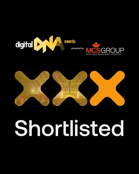
Digital DNA Award Nomination
February 24, 2023
Insights
MaxDecisions Q&A
January 31, 2023
Insights
Partnering up or selling up? Your Brand Story could make the difference.
Want to get connected? Let's chat.
Get in touch


